How Your Website Design Impacts Client Trust and Conversion Rates
Your Website Is Your First Impression — Make It Count
Imagine a potential client landing on your website for the very first time. Before they’ve read a single sentence or clicked a button, they’re already forming opinions. Can I trust this brand? Do they feel professional? Is this what I’ve been looking for?
Your website design quietly answers all of those questions in seconds. From layout and colour choices to fonts and written content, every visual decision shapes how visitors perceive your business often before they’re consciously aware of it.
Whether you’re a therapist, coach, photographer, or creative entrepreneur, your website is your digital home base. A confusing or outdated design does the opposite. And in a world where attention spans are short, that first impression truly matters.
Understanding The Psychology Of First Impressions On Websites
Website Visitors Decide in Seconds
Research consistently shows that users form an impression of a website in as little as 0.5 seconds. That means trust and credibility are either established or lost almost instantly. Visitors don’t wait around to figure out what you meant to communicate- they react to what they see right away.
A polished website design signals professionalism, care, and intention. Clean layouts, cohesive colours, and readable fonts aren’t just for the aesthetics- they reassure visitors that your business is established and dependable. On the other hand, cluttered pages, mismatched styles, or difficult navigation can quietly undermine trust, even if your services are excellent.
The Halo Effect in Design
This phenomenon is known as the halo effect: the tendency for people to assume that something visually appealing is also high-quality. When your website looks organized, cohesive, and thoughtfully designed, visitors naturally extend that positive perception to your services.
A strong small business’ website design doesn’t just look good. It creates a psychological shortcut that helps clients feel confident choosing you.
Aligning Website Design With Your Brand’s Personality
Your website should feel like an extension of your brand, not a generic template. When design choices don’t align with your personality or audience, visitors can sense the disconnect. I’ve come across businesses that don’t have a solid brand foundation, which in my opinion is essential. I’ve received a business card from someone that looked totally different from their website, and then also totally different from their Instagram account. Consistency is really key- and that often starts before the website process with brand design.
Match Your Business’ Tone and Audience
Different businesses call for different emotional cues. A therapist’s website might lean into calming colours, gentle fonts, and generous spacing to create a sense of safety. A photographer may prioritize bold visuals and minimal copy to let their work speak for itself. A consultant or bookkeeper often benefits from clear structure and professional styling that communicates reliability and expertise.
The overall goal is to evoke the same emotions you want clients to feel when working with you. When design and brand personality align, trust feels natural rather than forced.
Define Your Visual Voice
Before diving into design details, define some words that describe your brand- for example, warm, refined, confident. These words become your filter for every visual decision, from colour palette to imagery to font pairings. If your business has worked with a brand designer, you may already have some of these aspects in place, and it's important to follow those guidelines closely to make sure everything is cohesive!
Simplifying Your Website Navigation and Layout
Confusing navigation is one of the fastest ways to lose trust online. When visitors can’t find what they need quickly, they leave.
A streamlined navigation menu (at the top of your website) helps visitors feel grounded and supported. Aim for five main pages or fewer in your primary navigation. Too many options can feel overwhelming and make users unsure of where to go next. If there are more than 5 pages, consider using a drop down menu (similar to the services page at the top of this website)!
Clear, intuitive navigation sends a subtle but powerful message: this business is organized, thoughtful, and easy to work with.
Showcasing Social Proof & Clarity On Your Website
Sharing Testimonials On Your Site Builds Confidence
Client testimonials are one of the most effective trust-building tools you have. Instead of hiding them on a single page, share them throughout your site. A short quote beneath a service description or a featured testimonial on your homepage can significantly improve conversion rates.
Being Transparent About Your Services Is Best
Vague language creates hesitation with your potential dream clients. The best thing to do on your website is to clearly explain what you offer, how your process works, and what the next step looks like.When people know what to expect, they’re far more likely to move forward.
Prioritize Mobile Website Design & Accessibility
In today’s digital landscape, mobile design is no longer optional — it’s a trust signal.
If your website looks great on desktop but feels clunky on mobile, visitors may perceive it as outdated or unreliable. Squarespace websites are mobile-responsive by default, but it’s still essential to preview your site on multiple devices to ensure everything feels seamless. A smooth mobile experience signals professionalism and care.
Accessible design shows consideration for every visitor. Readable font sizes, sufficient colour contrast, and alt text for images don’t just improve usability. This communicates your values as a company too! This attention to detail builds ethical credibility, strengthens SEO, and reinforces trust with a wider audience.
Calls To Action That Drive Conversions
A trustworthy website doesn’t push its visitors, it guides them to where you want them to be! A way to help your website convert is by placing strategic calls to action (also known as CTAs).
Clear CTAs help visitors understand what to do next. Buttons like Book Now, or Let’s Connect should appear consistently across your site, and in most sections. Using consistent button styles and confident language creates a sense of momentum without pressure.
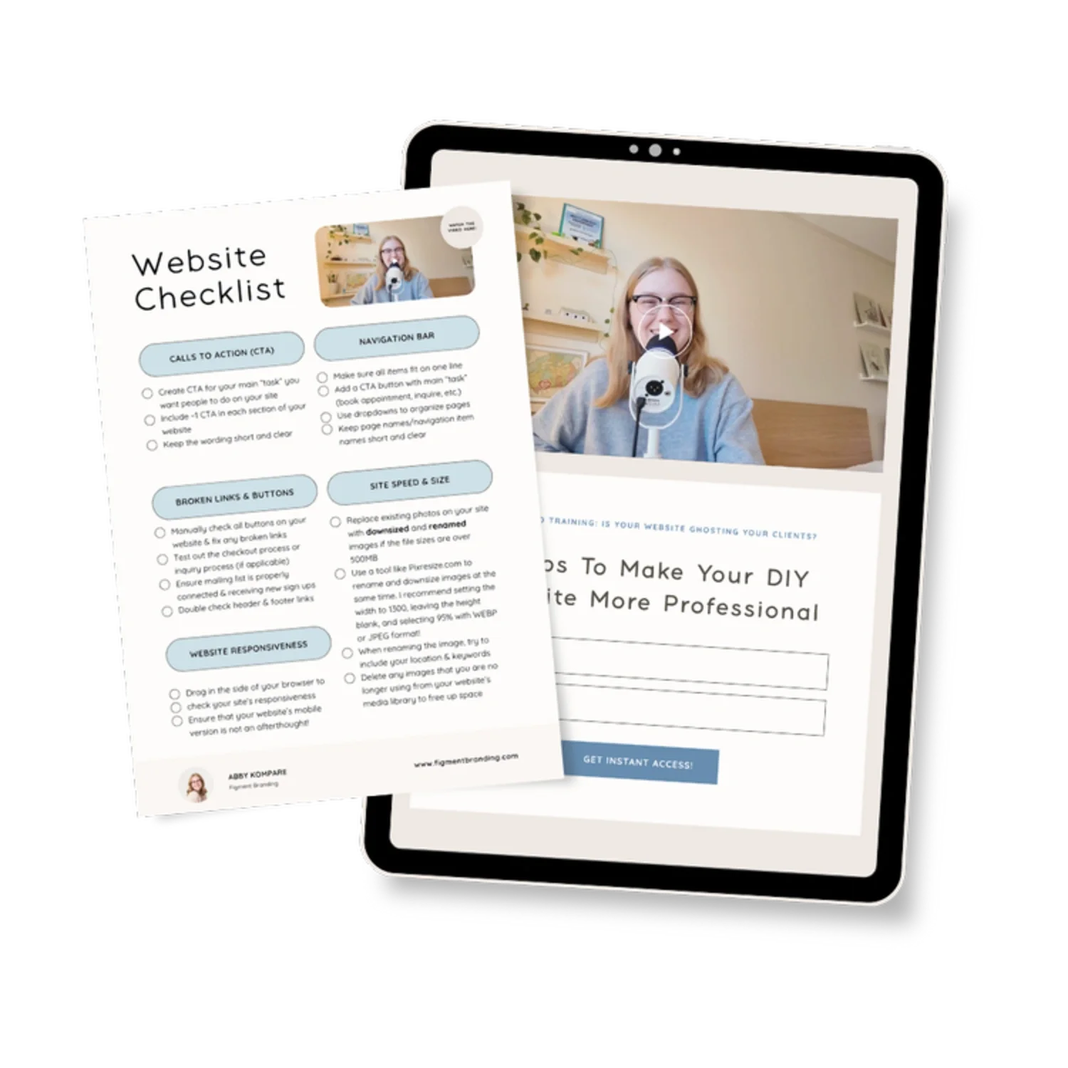
Our 5 Tips For Making Your DIY Website Look More Professional
We’ve put together a free video training for you all about how to improve your website and drive more traffic to your business. This video goes over things like website navigation, calls to action, and more. You can download it for free, and get the accompanying checklist here!
Overall, your website is more than a portfolio. It’s a trust-building tool that works for you around the clock.
Thoughtful brand website design creates clarity, builds emotional connection, and reassures visitors that they’re in the right place. And in an increasingly crowded online space, that sense of trust is what truly sets your business apart.